RESPONSIVE WORDPRESS DESIGN
From big screen to pocket size, your website must be created to operate on all sizes. Don’t let the size limit its performance, be sure it can meet its purpose.
No more sitting at a desk needed – the times have definitely changed and mobile devices are key for web browsing now.
Technology advancements mean access to your business website isn’t limited to one location: soon, your visitors can see your page while crossing the city, getting ready for work, or in the middle of their favorite show.
Having a mobile responsive site guaranties that no matter the device, no matter the size of the browser, customers will get the most out of their experience with you. My creation process includes a 100% responsive web design that you know you can count on.
Keep up with your audience
Are you looking to set your business apart? Be sure your website stays current
with the release of new devices and make it responsive! So, from researching
a service to searching for a local business, or simply shopping online, your
website will be future-proofed for all new devices.
Get More for Less
Apps are everywhere right now and it’s becoming increasingly common to see
businesses releasing their own. They do make devices more functional, but
often cost more to create than making a website responsive.
Optimum mobile performance is an absolute must-have
Offering the ultimate mobile experience puts a smile on your customers’ faces
and simplifies how to use your website when on a mobile device. If they find
the journey enjoyable and simple to navigate, it encourages them to make a
request or purchase with ease.
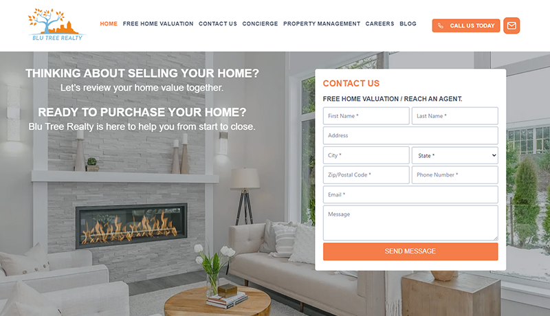
BLU TREE REALTY
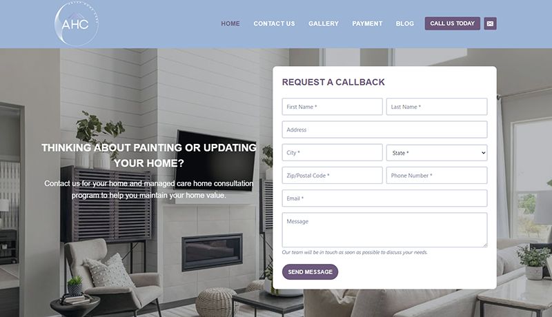
ARTEP HOME CARE
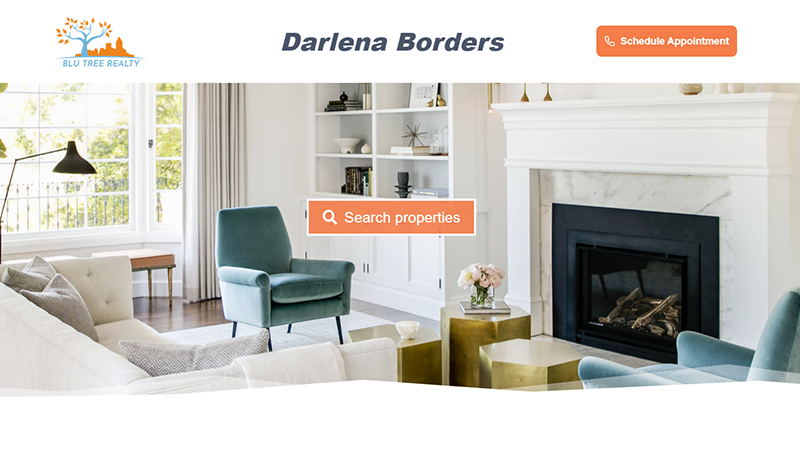
DARLENA BORDERS
READY TO LAUNCH A PROJECT?
I’d love to find out more about your Responsive WordPress Design enquiry. Get in touch today.