Improving User Experience with WordPress Navigation Menus
 Reading Time: 4 minutes
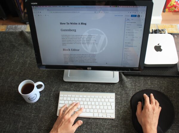
 When it comes to your website, navigation menus are like trusty guides that help users find their way around and make their visit better. When you have a navigation menu that’s designed well and easy to use, it can really make a big difference in how people interact with your site. So, in this article, I’m going to show you some helpful tips for making the most out of your WordPress navigation menus. Let’s get started and make your website navigation even better!
Understanding User Behavior
If you want people to find what they’re looking for on your website, you need a good navigation menu. Take a look at your website’s analytics to see which pages people visit the most, how they move around your site, and what they do. This information will help you figure out the best way to organize and design your navigation menu.
Keep it Simple and Intuitive
Simplicity is key when it comes to navigation menus. Design your navigation menu to be simple and user friendly, enabling visitors to find their desired content. Use clear and concise labels for menu items and avoid jargon or technical language. Consider organizing menu items in logical categories and subcategories to make navigation easy.
Limit the Number of Menu Items
Too many items in your navigation can be too much for visitors, complicating their search for the content they need. Limit the number of menu items to the most important and relevant pages. Focus on the main sections of your website that matter the most. And if you want to add some extra links without making a mess of your main menu, think about using dropdown menus or mega menus. It’s a smart way to keep things organized and easy to navigate.
Use Descriptive and Consistent Labels
When it comes to labeling your menu items, make sure they actually tell people what they’ll find. Skip the boring stuff like “Products” or “Services” and get more specific. Try using labels like “Web Design Services” or “Ecommerce Solutions” to give folks a clear idea of what they can expect. And don’t forget to keep things consistent across all your pages. That way, your visitors will have a smooth and enjoyable time exploring your website.
Optimize for Mobile Devices
With more and more folks using their phones to browse the web, having a navigation menu that works well on mobile is super important. So, make sure your menu is responsive and shows up nicely on those small screens. Think about using a hamburger menu or a dropdown menu that’s made for mobile devices. It’ll help make things super easy for folks using their smartphones to navigate your website.
Highlight the Current Page
Making your website easy to use is important. You can help your users by adding visual indicators that give them hints about the page they’re on. One way to do this is by highlighting the menu item that corresponds to the page they’re currently viewing. This will make it easier for users to understand where they are on your website and navigate through it.
Include a Search Functionality
Adding a search function to your navigation menu can improve how users interact with your website. It lets them easily find what they’re looking for by typing in keywords or phrases. You might want to think about putting a search icon or a search box right in your menu, so it’s easy for people to see and use.
Test and Improve
Making your navigation menu better for users is something you need to keep working on. Try out different menu designs, labels, and ways of organizing it to see what works well. Look at heatmaps, click-tracking tools, and what users tell you to understand how they behave and what they like. Keep making your navigation menu better based on the information and feedback you get.
Track Performance and Analytics
Keep an eye on how well your navigation menu is doing and look at the numbers. See if you notice a lot of people leaving your site quickly or not clicking on certain menu items. Get to know your website visitors well. Use Google Analytics to see how long they spend on each page, how often they click on things, and how they move through your site. This information will help you find places where you can make things better and use the data to decide how to improve your navigation menu.
Stay Updated with Design Trends
Web design changes as time goes on, so it’s important to keep up with the latest trends and make sure your navigation menu looks modern and attractive. Keep up with the latest design trends, see what’s popular, and explore websites that have unique and creative navigation styles. Consider adding elements to your website that align with your brand and appeal to your target audience. But remember, it’s more important to make sure your menu is easy to use and friendly to users than to follow every trend.
Conclusion
First, understand how users behave and design your navigation menu accordingly. Keep it simple and easy to understand. Don’t add too many items on the menu. Use clear and descriptive labels . Make sure your menu works well on mobile devices. Highlight the page the user is currently on. Add a search function so people can find what they need. Test and improve your menu based on user feedback. Keep an eye on how it performs and look at the analytics. Also, stay updated with the latest design trends. Focus on these tips, your visitors will be happy about it.

ABOUT IVAN
Freelance Creative WordPress Developer and Computer Technician based in Germany, helping clients make the most of their websites, as well as troubleshooting computer problems by remotely accessing their systems. I create dynamic, responsive web designs that look great on all devices – from small to medium-size businesses.